

PREMIUM HOSPITALITY
Novu Lounge
Partner
Industry
Location
Scope
Year
Novu
Premium Hospitality
New York
Brand Identity Architecture · Digital Asset Design
2025
An identity that reads the new not as speed, but as a pause.
Project Information
BrandEnn developed the brand identity architecture for Novu Lounge in New York. The name NOVU comes from the Latin root 'novus,' meaning new. When a new brand's name signifies newness, the initial reflex for its identity is often to convey speed: bright colors, sharp movements, quickly consumed energy. For a lounge, this reflex works in the wrong direction. Guests come there not to accelerate, but to slow down. Our first decision, therefore, was not to interpret newness as speed.
"A brand's character is most evident in the choices it does not make."
Context and Challenge
Coffee and beverage brands have long converged in the same safe space: brown tones, a warm yet indistinguishable language. This space is safe because it's familiar, but also undifferentiated for the same reason.
The second issue for Novu was the physical space. Not every identity that stands strong on paper endures in a physical space. A logo looking good on a screen or business card does not mean it will be legible in the evening light, on a facade, or from across the street. These are two separate disciplines.
The identity needed to both differentiate itself from the category and carry the same character inside and outside the venue.
Insight and Construction
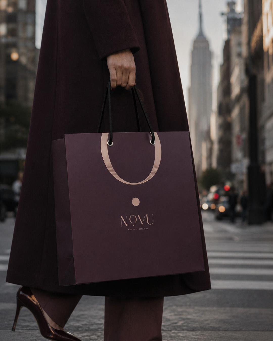
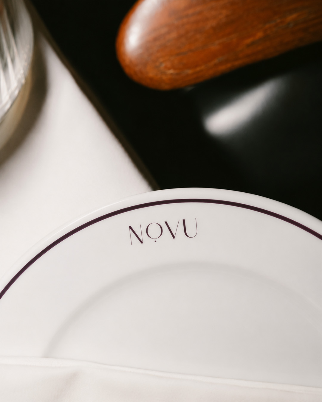
We placed a single dot beneath the letter 'O'. A pause situated in the middle of the name. This is, after all, the promise of a lounge: to slow down the evening.
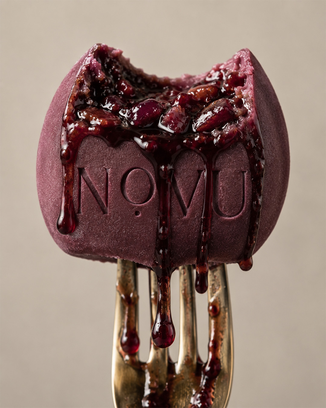
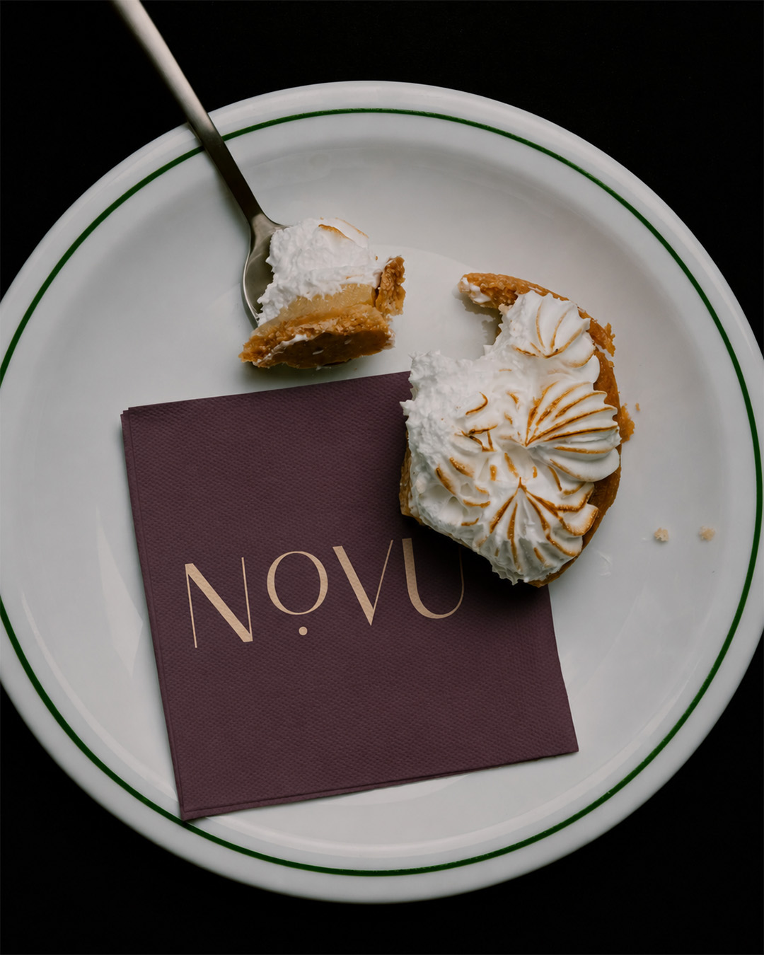
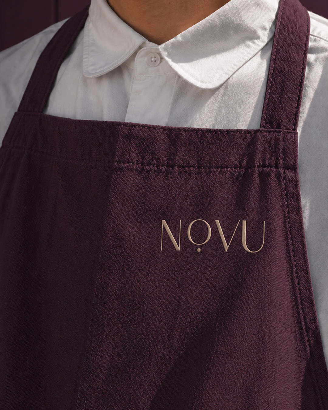
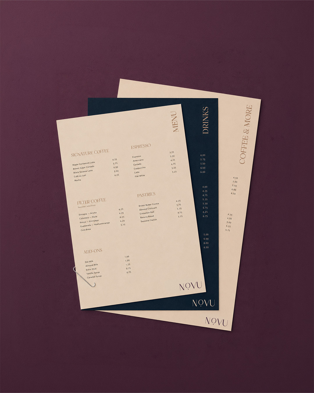
We separated the palette from the category. Instead of brown, we chose Pantone 5185 Velvet Plum and Pantone 296 Midnight Ink. Both are tones that read well in low light. The colors of the evening, not the morning.
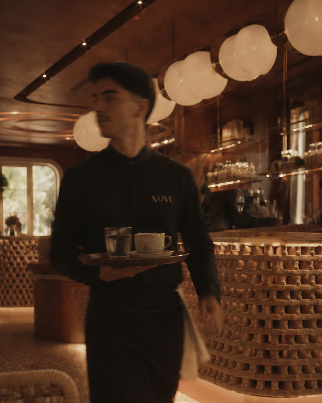
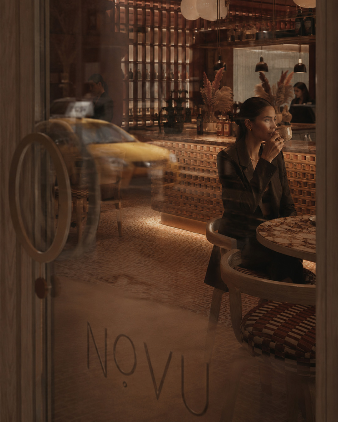
We also designed the facade in the guidelines, because a lounge's first page is its door. The awning color, the purple armchairs visible through the window, the watermark pattern on the wall, and the warmth of the interior lighting are all parts of the same system.
A brand identity system is tested in its smallest application. The NOVU monogram appears as a colorless emboss on the business card. No ink, just the paper's own surface. It's not even visible when light doesn't fall on it. The same form is legible from across the street on a 150 x 100 cm facade flag. Between these two scales are the watermark pattern, envelope flap, table flag, and pocket folder.

Result
A guest reads the brand before even passing through NOVU's door. A decision is made before the menu is opened: this is not a place to rush. Brand identity architecture is not about drawing a logo. It is about deciding where that logo will grow and where it will fade.