Ice cream
Luculus
A seventy-year legacy, carried into a contemporary language.
- Brand
- Luculus
- Sector
- Ice cream
- Location
- Bratislava, Slovakia
- Scope
- Brand Identity Architecture · Digital Asset Design · Social Media Communication Strategy
- Year
- 2022
Project Details
BrandEnn created the Brand Identity Architecture, Digital Asset Design and Social Media Communication Strategy for Luculus, Slovakia's long-established ice cream brand. Luculus has been part of Slovakia's ice cream scene since 1954. Seventy years of history, a taste habit earned across four generations, a place in the summer memories of Slovak customers.
When the brand came to us in 2021, it served customers from two locations. It carried its own heritage, but the visual expression of that heritage for today had not been built yet.
The brief was clear. The identity had to be renewed and the brand reintroduced to today's customer, while the heritage that began in 1954 was protected.
It was a delicate balance. Renew too little, and the brand stays in the past. Renew too much, and it drifts from its roots. Either way, the bond with its audience wears thin. This was the classic challenge long-established brands face in the digital age. The older generation of Slovak customers knew Luculus, had loved it since childhood and kept coming back.
The new generation, Gen Z and younger millennials, had filed Luculus away as "the place my grandmother goes" and left it off their own list of choices. At the same time, this generation valued the visual identity of the brand they bought ice cream from, its social media aesthetic and how well it photographed.
Luculus's existing language did not reach this generation. The need was not repositioning but renewal. Not the essence of the brand, but its presentation had to be updated.
"The brand had to feel rooted, not old. The two are different things."

Context and Challenge
There is only one right way to renew a long-established brand. Do not fight the heritage. Read it again. The Luculus of 1954 was a contemporary brand of its own time. We had to build the contemporary Luculus of 2021. With the same spirit, in today's language.
This was not a redesign chasing fashion. It meant expressing the brand's timeless essence in today's language. Brands that connect with local heritage against global chains were resonating with young customers too. Luculus's seventy-year history was its strongest card. It needed the right frame.

Insight and Build
We put two principles on the table as we renewed the identity. The warmth that began in 1954, and today's visual discipline.
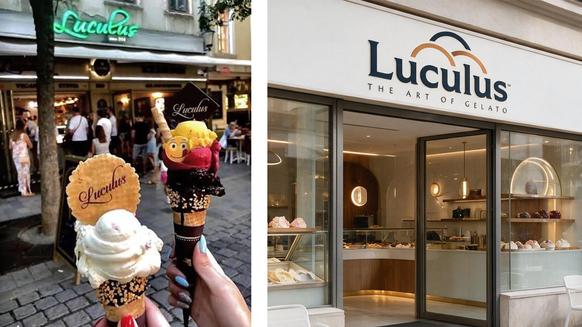
We did not start the logo from scratch. We refined it from its existing form. Recognition was protected for the older generation, and a modern expression was built for the new one. In the color palette we simplified the brand's classic tones. In place of an old palette that wandered between pastel and bright, we designed a clear, decisive set that photographs well.
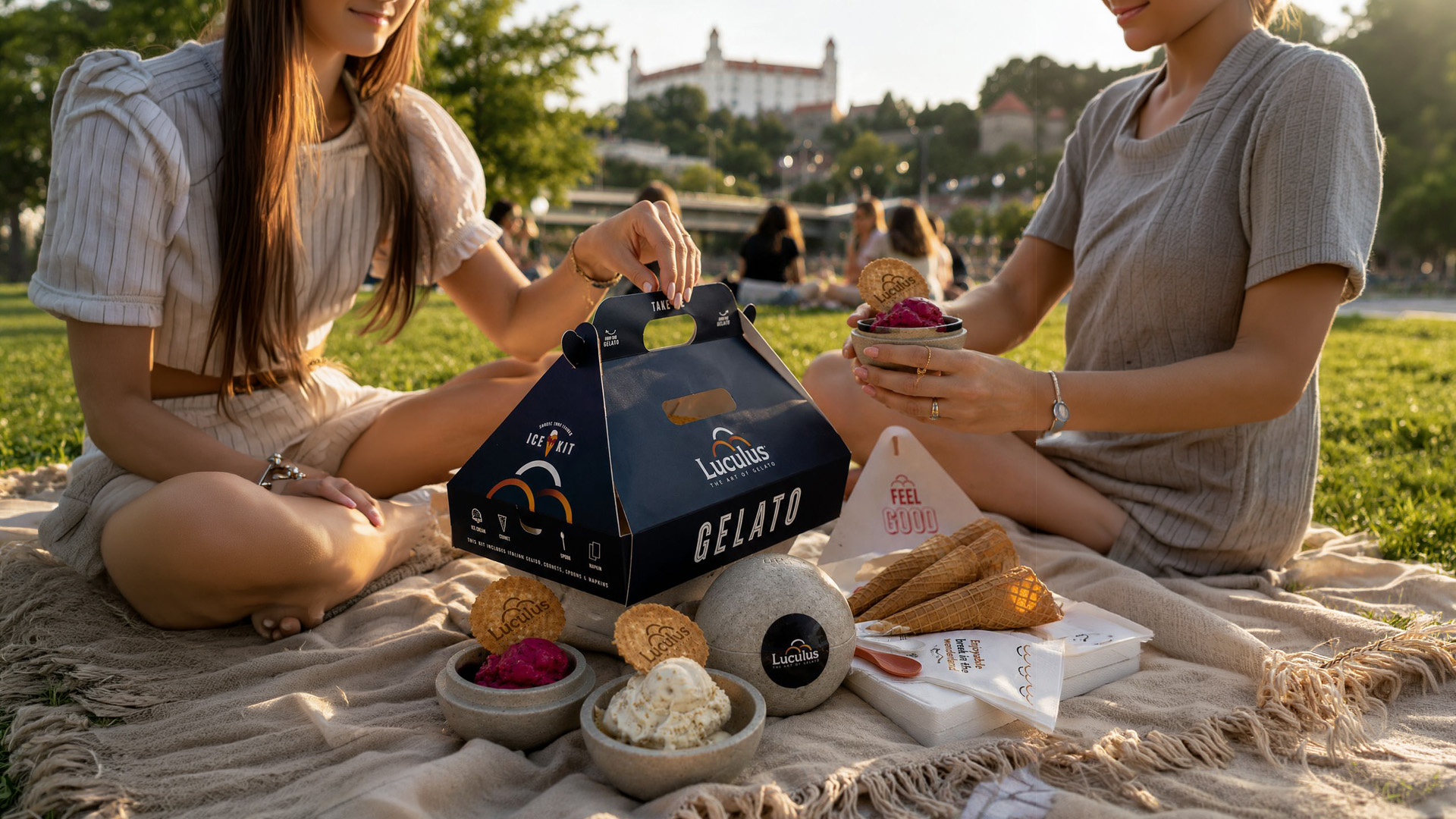
We developed a standard for the store atmosphere. A visual system that lets every customer walking into the current locations, and into every new one opened in the future, feel the same character. Typography, display case layout, the visual hierarchy of the serving plate, menu design. All of it would speak like different rooms of one brand.
Online, we shaped a social media language for the new generation. We blended the brand's archive from 1954, its old photographs, its first display case, scenes from the founding era, with the new content language. Every post that showed the past entered the frame with today's aesthetic.
Digital Assets
On the Luculus site, visitors choose as if they were standing at the counter.
At the opening, a single cone stands at the center of the screen. As you scroll, the flavor changes and its name grows behind it.
Archive footage from 1954 flows inside the figure 70+. Seventy years of heritage is told not in a long text but in a single number, and not as a document of nostalgia but as a notice that a flag is still flying.
The cones open like a fan, and the flavors turn with a single motion. The character the new generation wants to photograph is present in every frame of the site.
Outcome
Luculus still serves the same ice cream in Slovakia today. But now it serves two generations together rather than one. The older generation finds the brand in its own memories, while the younger generation makes it its own on social media, on summer evenings and in weekend routines. The brand has grown from the two locations it had when we began working together in 2021 to four today. The renewed identity worked not only as a visual refresh but as the ground for real growth. Two generations meet in the same store and stand in front of the same counter.


Scroll sideways
They left a strong mark on our historic brand. They made an important contribution to Luculus's growth.

This is the hardest leap a long-established brand can make.
Let's design your brand's transformation together.
Every engagement begins with a one-hour Strategic Diagnostic Session. We work with a small number of brands each year. We reply to every consultation request within 3 business days.Request a Consultation