Olives and olive oil
Rem Zeytin
The story not of a product, but of a land.
- Brand
- Rem Zeytin
- Sector
- Olives and olive oil
- Location
- Bursa, Türkiye
- Scope
- Brand Identity Architecture · Digital Asset Design
- Year
- 2018
Project Details
BrandEnn created the Brand Identity Architecture and Digital Asset Design for the olive and olive oil brand Rem Zeytin. Rem Zeytin came to us as a food brand that positions olives not as a shelf product but as the fruit of a land and of labor. The category itself was crowded. The olive and olive oil shelf was full of look-alike greens, clichéd branch imagery and packaging that repeated the promise of "natural" at full volume.
That was the question in front of us. When the claim of naturalness is something everyone uses, how do we turn Rem's naturalness into character rather than a claim to prove? The gap between a brand saying it is real and making people feel it is real is exactly where this category divides.
We began by decoding the category's visual language. We studied what the shelf repeats, which codes customers no longer see and which space is still open. In the olive category, most brands leaned either on rustic village warmth or on a sterile industrial language. Neither gave the balance Rem carried. Rem had to carry the warmth of the land and a trustworthy production discipline at the same time.
"In the olive category, you stand apart not by speaking louder but by speaking more clearly."
Context and Challenge
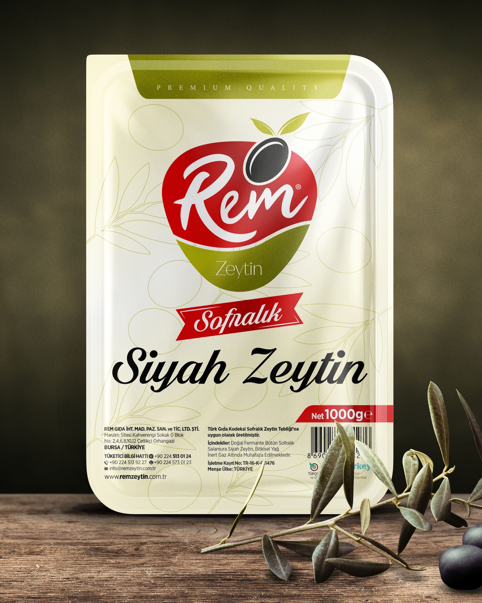
In food, and especially in a product with strong tradition like olives, trust is built through the visual before the taste. Customers look at the packaging and decide before they taste the product. In this category, the brand's job is to awaken appetite and trust at the same time.
This is also where premium food brands stand apart. An olive oil brand's value comes not from the words "extra virgin" on its label but from the sense of integrity it carries. What other products on the shelf say out loud, a strong brand makes people feel quietly. That was what Rem needed. To build naturalness not as a slogan but as a character present in every detail of the brand.
Rem was a product of the land, yet on the shelf it had to speak like a craft brand. The balance between these two ends became the starting point of the entire identity.
Insight and Build
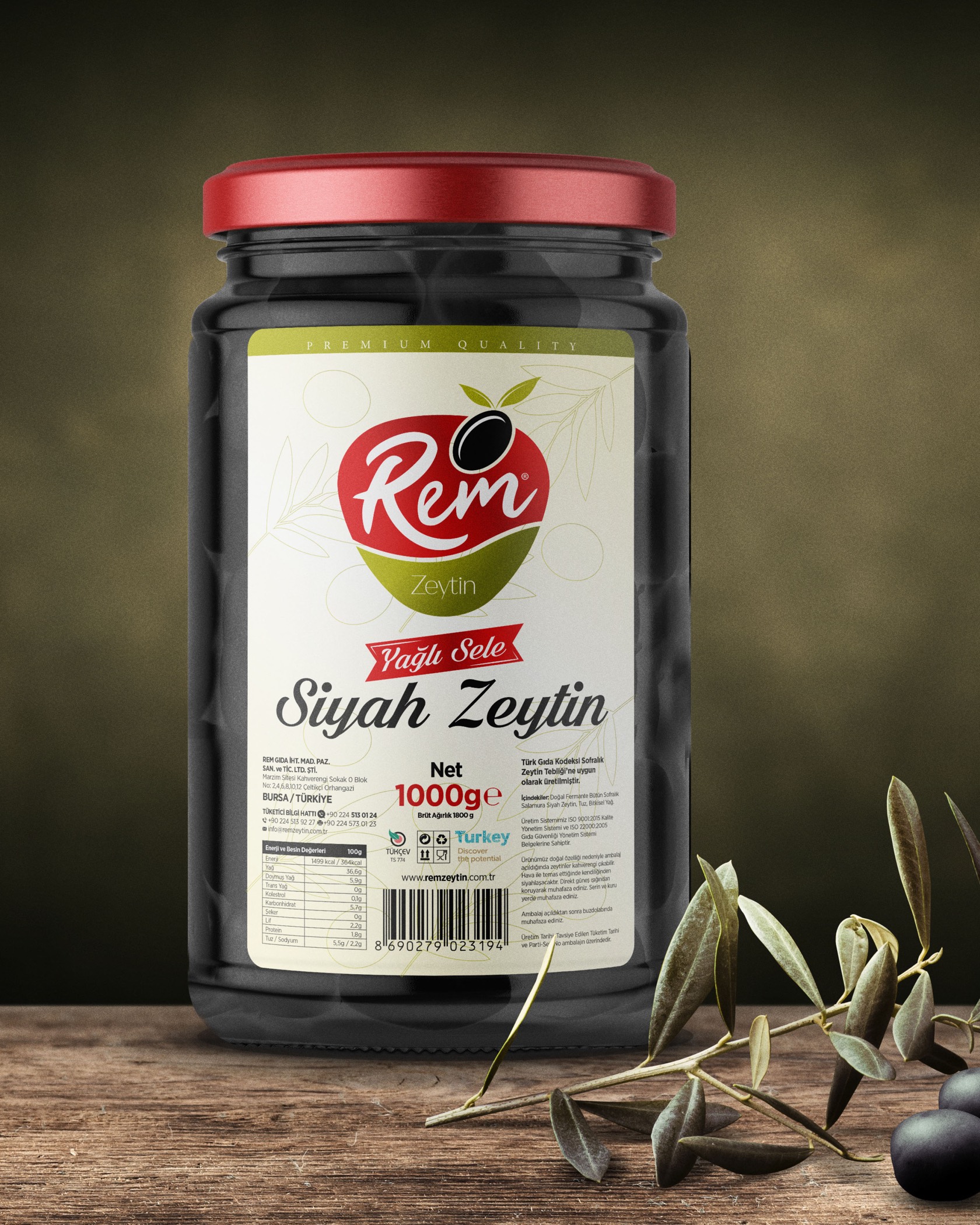
Rem's identity was built on three balances: natural but not rustic, warm but not cluttered, appetizing but not cheap.
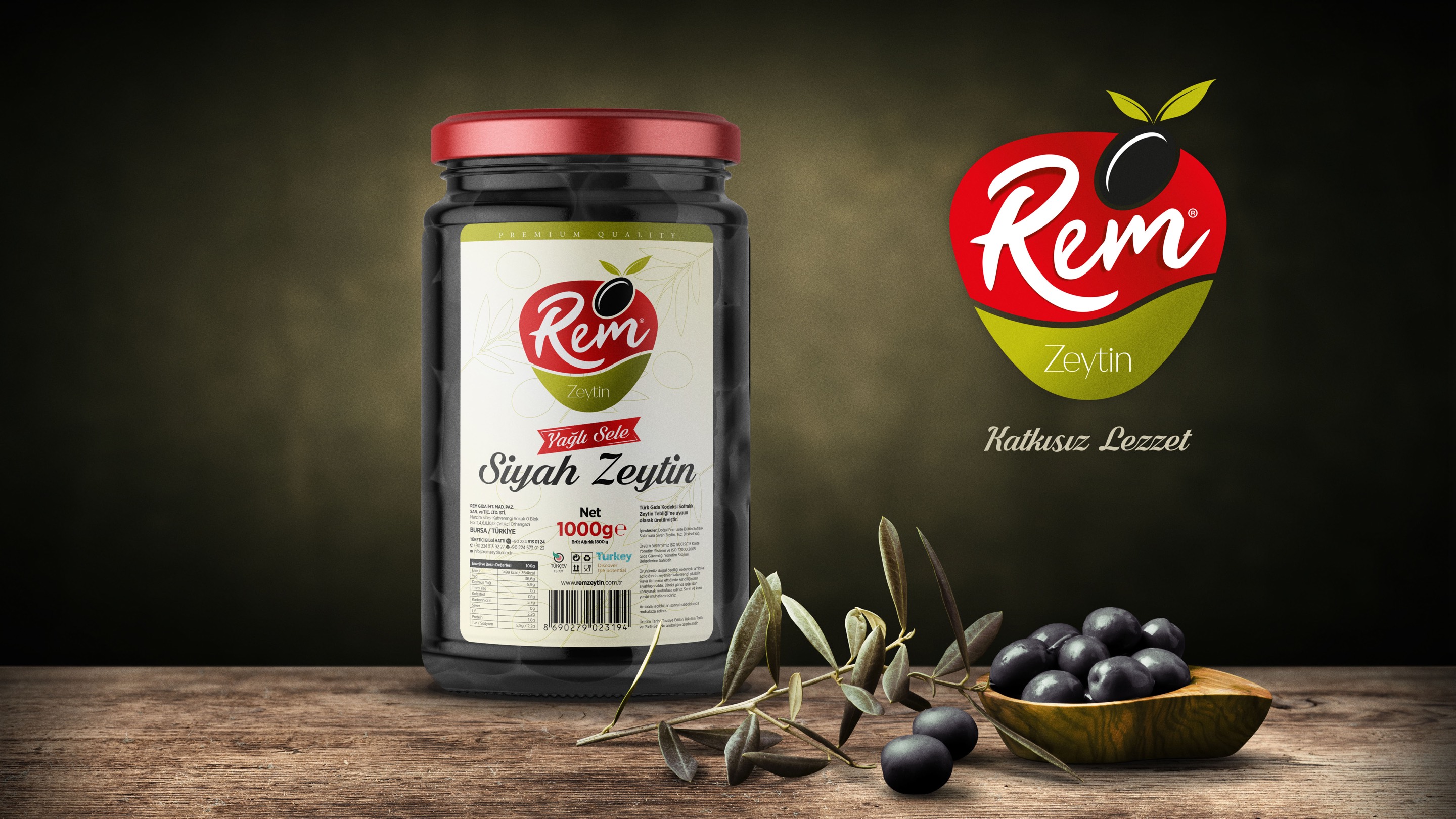
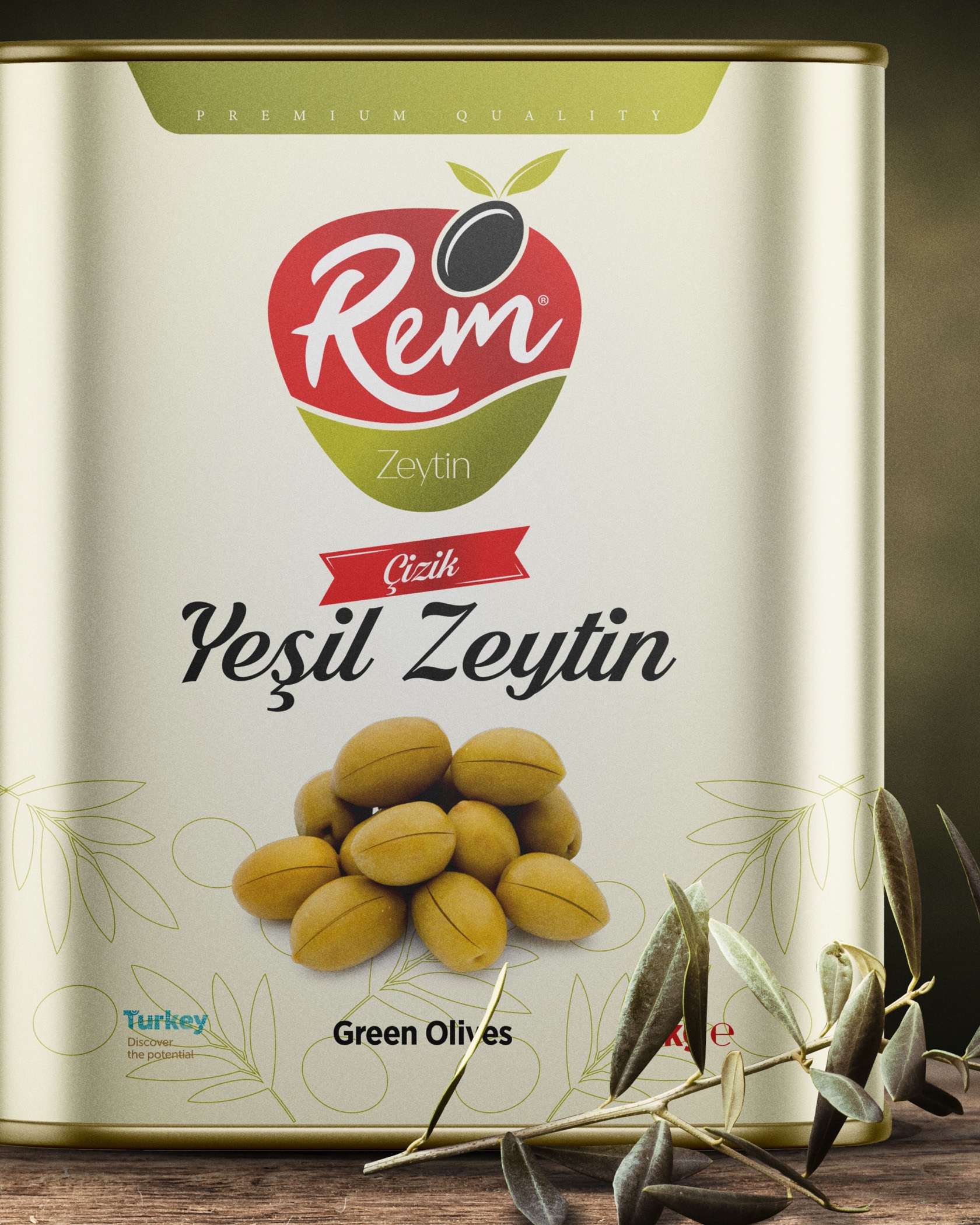
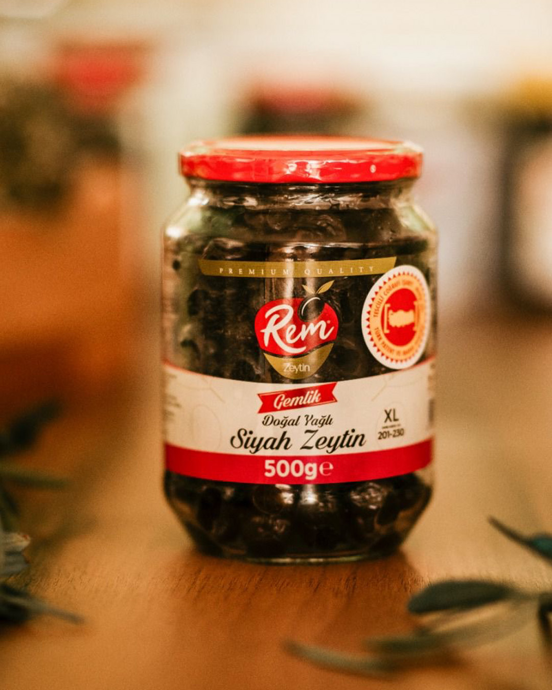
In the logo we drew a line that feeds on the form of the olive leaf and the fluidity of olive oil. The leaf carries the brand's origin and naturalness, while the flowing line refers to the product itself, the texture of the oil. The whole form was simplified to read more like a signature than a shelf product.
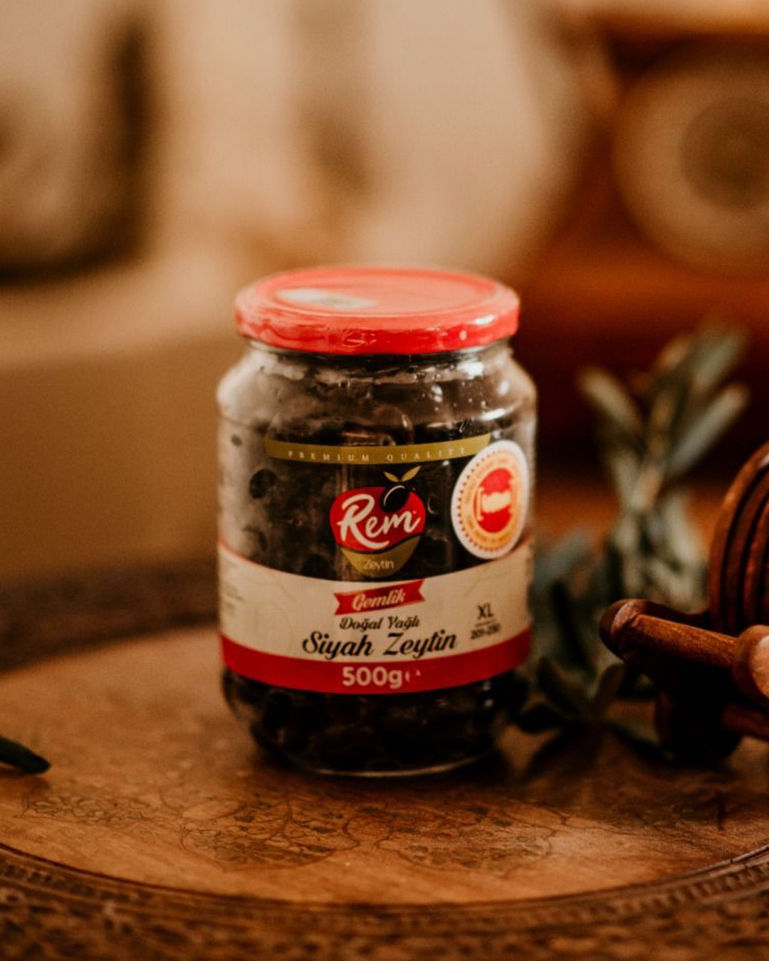
In the color palette we did not lean on the category's usual bright green. We used earth tones, a calm olive green and a warm accent that balances them. That warm accent was placed as a deliberate point of balance that stirs appetite without cheapening the packaging. Color took on the role of inviting without shouting.
The typography carried a simple, trustworthy character: a structure that is easy to read and clear on the shelf.
Digital Assets
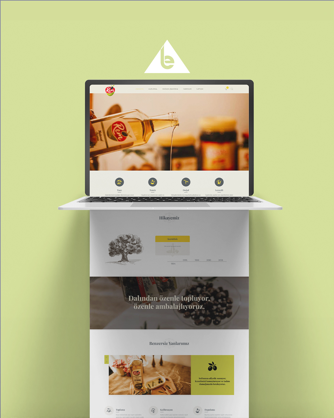
The Rem Zeytin site follows the olive from the grove to the table.
At the opening, a jar held in a hand greets the visitor. The package on the shelf passes into a human hand on screen, and the brand moves toward the table in the first frame.
The story is told along a timeline. A hand-drawn olive tree and the years turn the brand's roots not into a corporate text but into a line of growth.
We showed the harvesting, calibration, storage and packaging steps one by one. Instead of claiming naturalness, we made the process visible.
Outcome
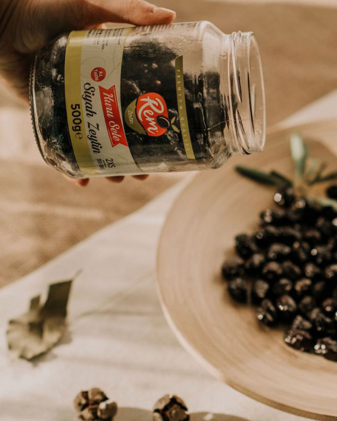
Today Rem Zeytin is positioned in its category not as a brand that says "natural" out loud but as one that makes naturalness felt through its stance. Among similar products on the shelf, it stands apart with its own character.
For a food brand, turning from a product into a character is the hardest step in a category that is easy to copy. In a field like olives, where everyone claims naturalness, what sets apart the brand that quietly turns that claim into proof is its own integrity. Rem has carried that integrity since the first day of its identity.
Scroll sideways
They carried Rem Zeytin's brand image to a strong position. We have seen the effects over the long term.
When a product begins to carry its own story, the shelf becomes small for it.
Let's design your brand's transformation together.
Every engagement begins with a one-hour Strategic Diagnostic Session. We work with a small number of brands each year. We reply to every consultation request within 3 business days.Request a Consultation