Hospitality
Novu
An identity that reads the new not as speed but as a pause.
- Brand
- Novu
- Sector
- Hospitality
- Location
- New York, USA
- Scope
- Brand Identity Architecture · Digital Asset Design
- Year
- 2025
Project Details
BrandEnn created the Brand Identity Architecture for Novu in New York. The name NOVU comes from novus, the Latin root for new. When a new brand's name says new, an identity's first reflex is usually to express speed. Bright colors, sharp motion, an energy consumed quickly. For a lounge, that reflex works in the wrong direction. Guests come not to speed up but to slow down. So our first decision was not to read the new as speed.
"A brand's character shows most in the choices it does not make."
Context and Challenge
Coffee and beverage brands have long gathered in the same safe space. Brown tones, a warm but look-alike language. The space is safe because it is familiar, and indistinguishable for the same reason.
The second question for Novu was the space itself. Not every identity that stands up on paper stands up in a venue. A logo that looks good on a screen or a business card will not necessarily read in evening light, on a facade, from across the street. These are separate disciplines.
The identity had to stand apart from the category and carry the same character inside and outside the venue.
Insight and Build
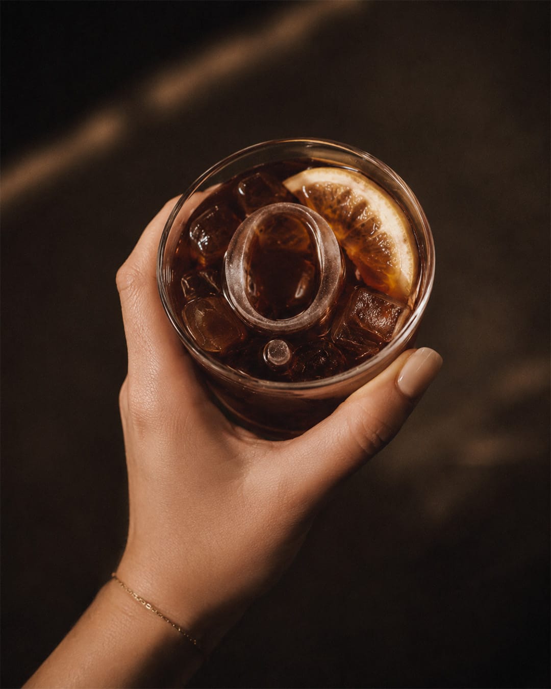
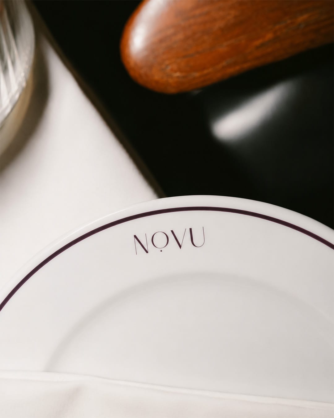
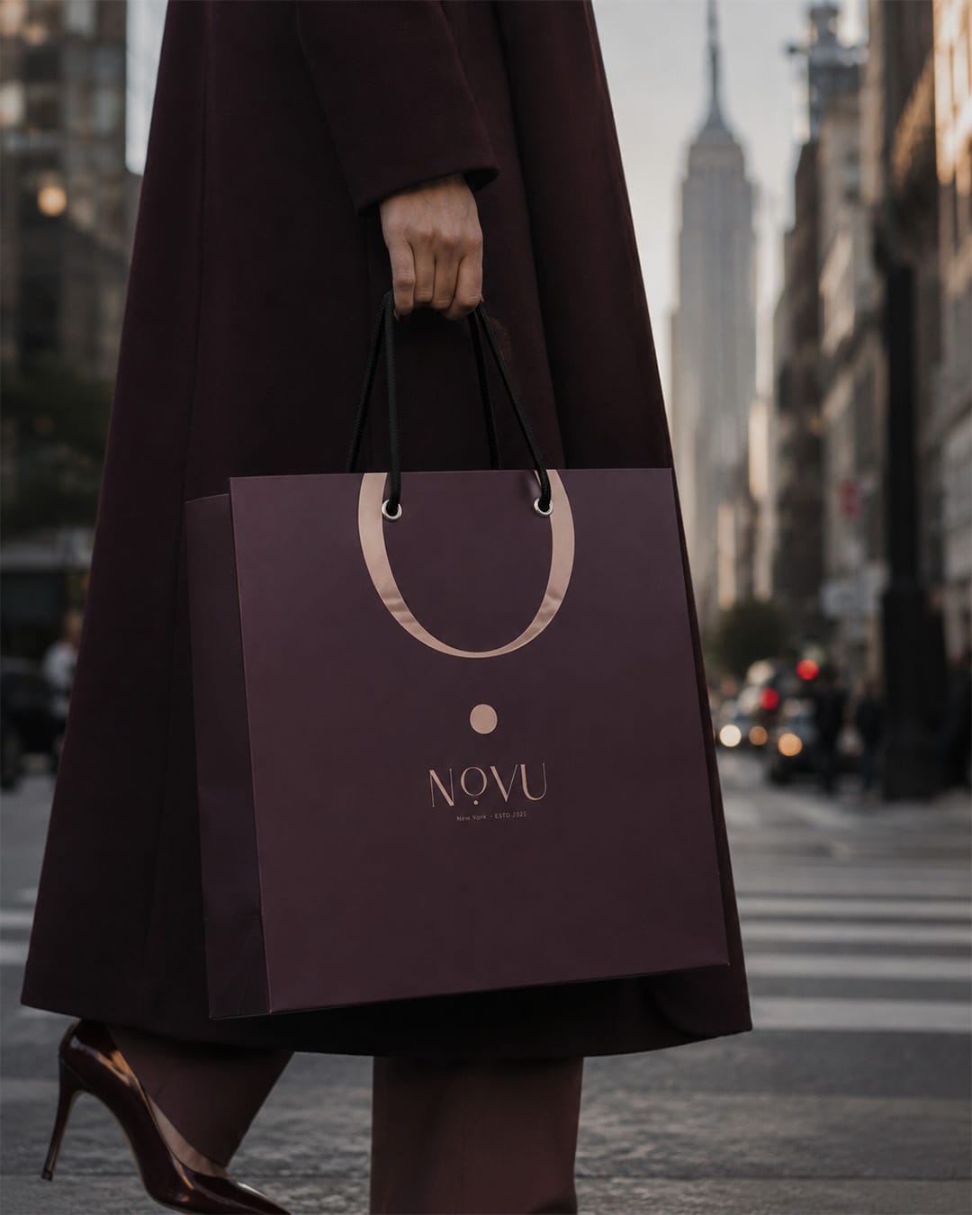
We placed a single dot under the letter O. A pause set in the middle of the name. That is the promise of a lounge anyway: to slow the pace of the evening.
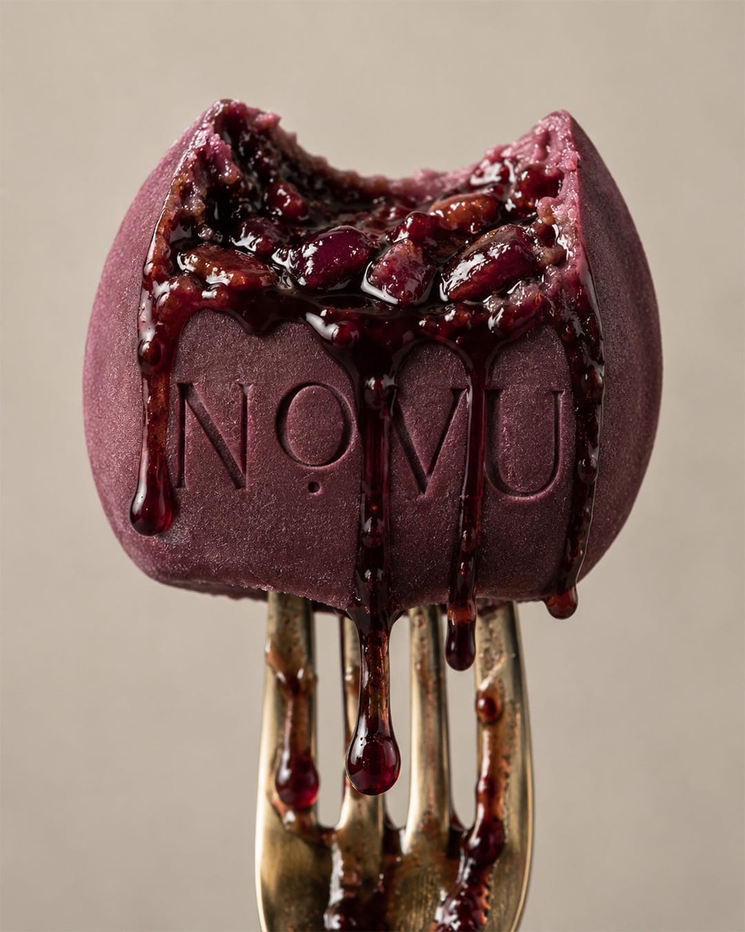
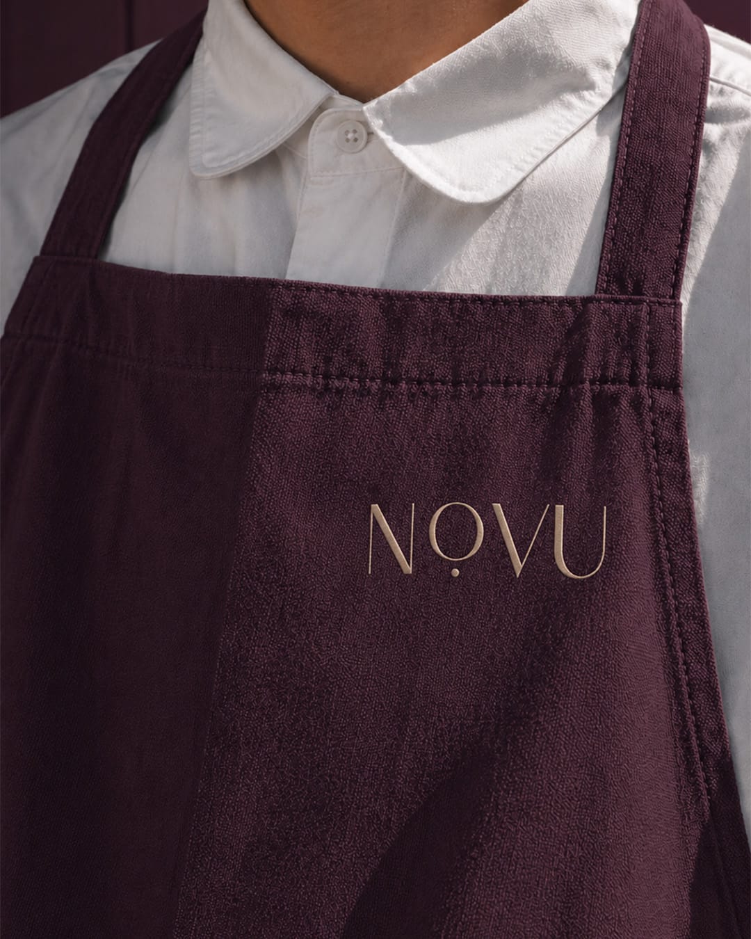
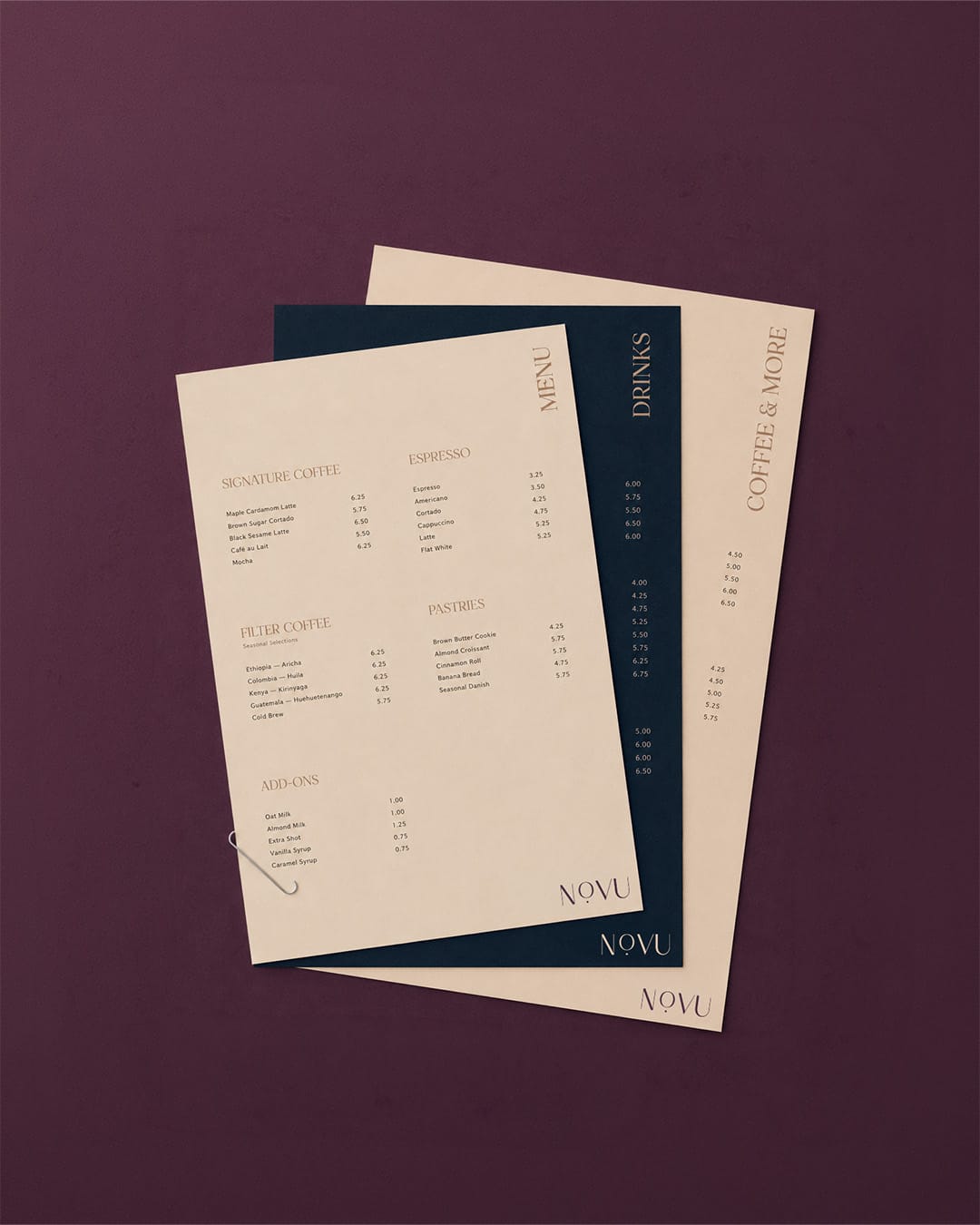
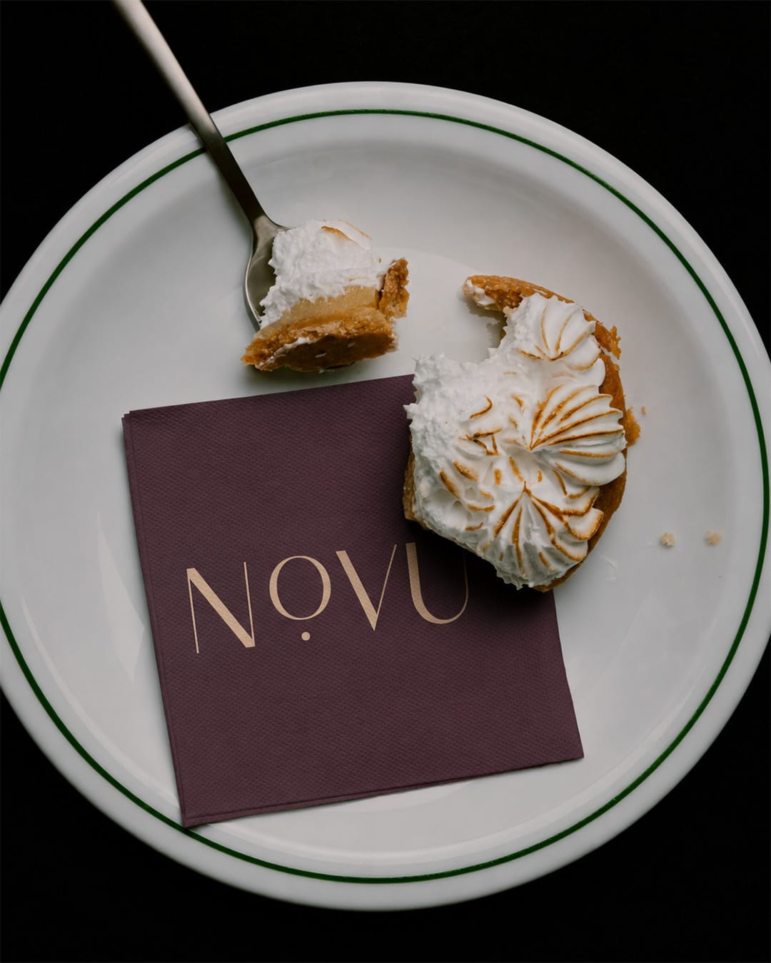
We set the palette apart from the category. Instead of brown, we chose Pantone 5185 Velvet Plum and Pantone 296 Midnight Ink. Both are tones that read in low light. The colors of evening, not of morning.
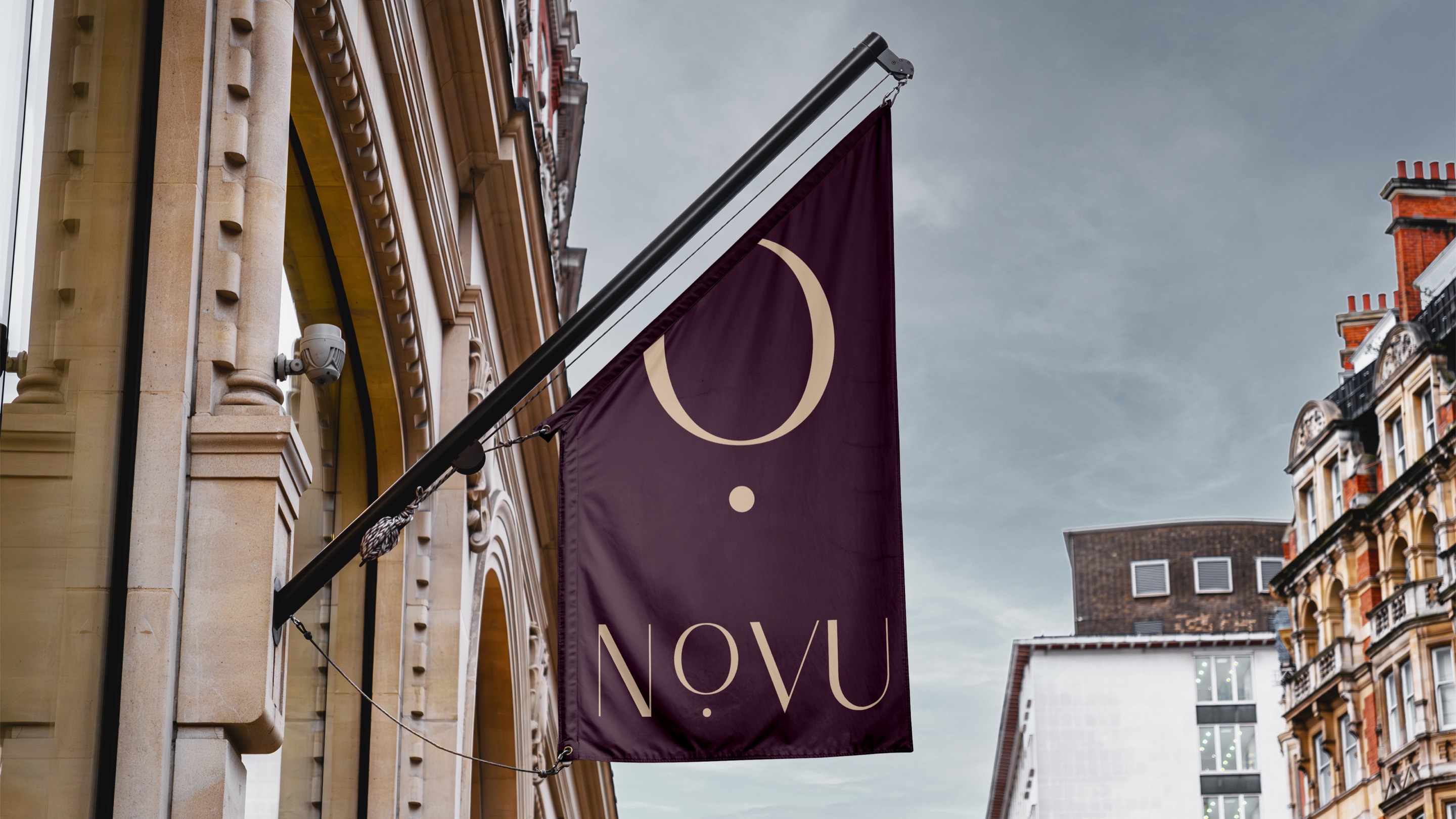
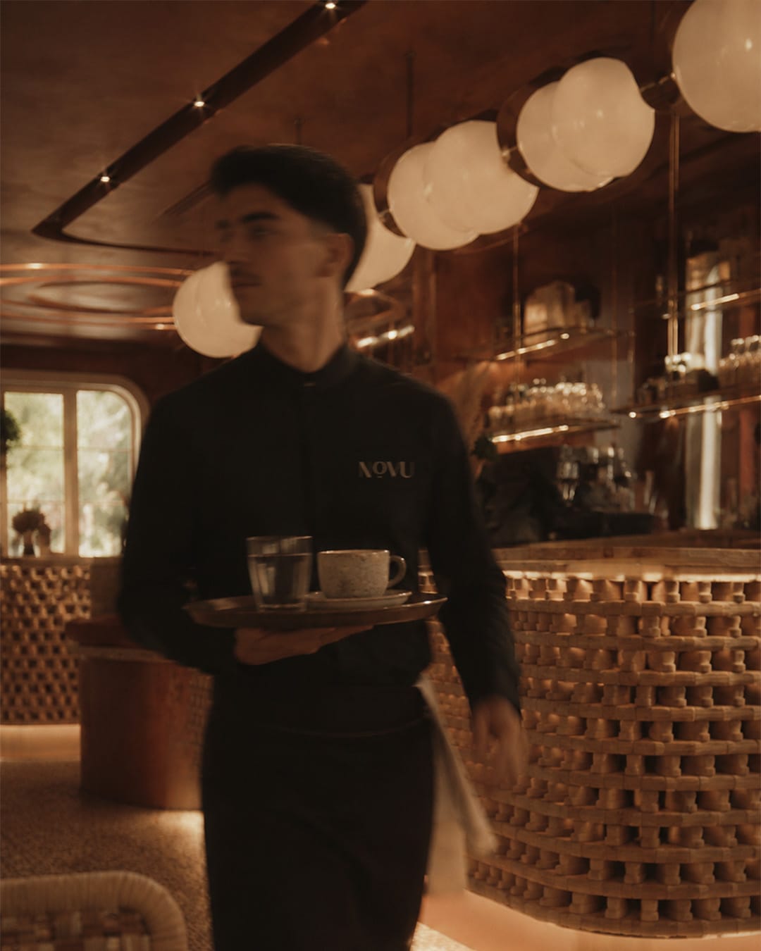
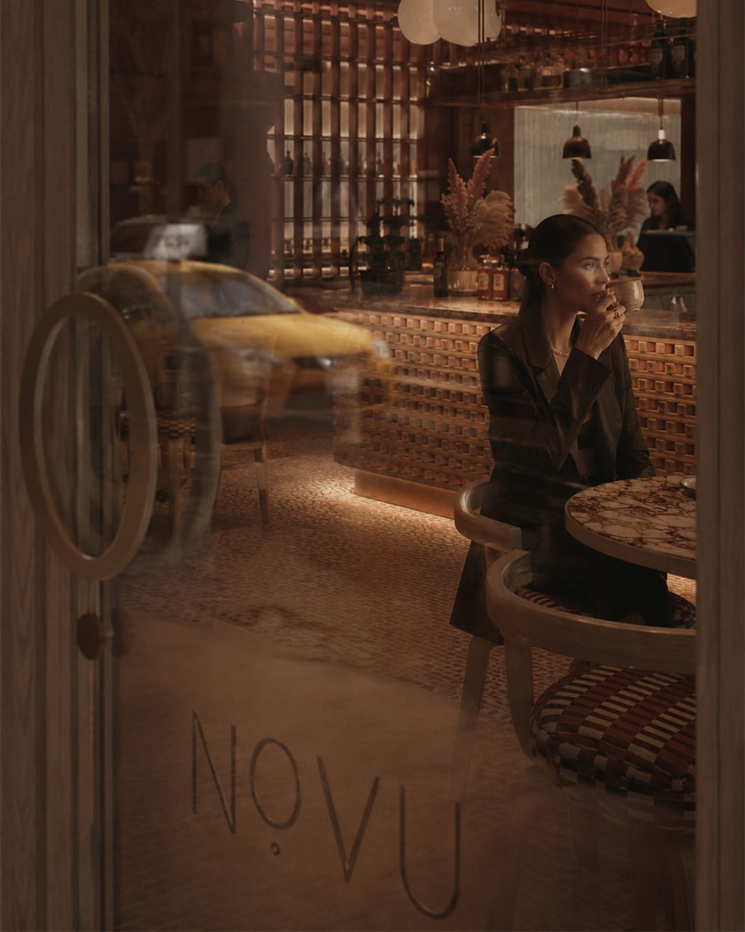
In the guidelines we also designed the facade, because a lounge's first page is its door. The color of the awning, the purple armchairs seen through the window, the watermark pattern carried onto the wall and the warmth of the light inside are parts of the same system.
An identity system is tested in its smallest application. The NOVU monogram sits on the business card as a blind emboss. No ink, only the surface of the paper itself. When light does not fall on it, it is not even visible. The same form reads from across the street on a 150 × 100 cm facade flag. Between these two scales are the watermark pattern, the envelope flap, the table flag and the pocket folder.
Digital Assets
We built Novu's site as the guest's first evening, before they walk through the door, not as a page of information.
At the opening, a single letter greets the screen. The O in the middle of the name and the dot beneath it carry the pause of the identity into the first frame of the page.
The Velvet Plum ground spreads the color of evening across the whole screen. The light tone appears only where something has to be read. The eye finds the text the way it finds the lit table in a dim room.
As you scroll, fine type and calm columns slow the pace of the page. The same character holds on the phone: whichever screen guests enter from, they meet the same evening.
Outcome
A guest has read the brand before walking through NOVU's door. A decision has been made before the menu opens: this is a place where no one hurries. Brand Identity Architecture is not drawing a logo. It is deciding where that logo will grow and where it will disappear.
Scroll sideways
Since Aura Lounge, we have worked closely with them on all of our brands.

A lounge's first page is its door.
Let's design your brand's transformation together.
Every engagement begins with a one-hour Strategic Diagnostic Session. We work with a small number of brands each year. We reply to every consultation request within 3 business days.Request a Consultation