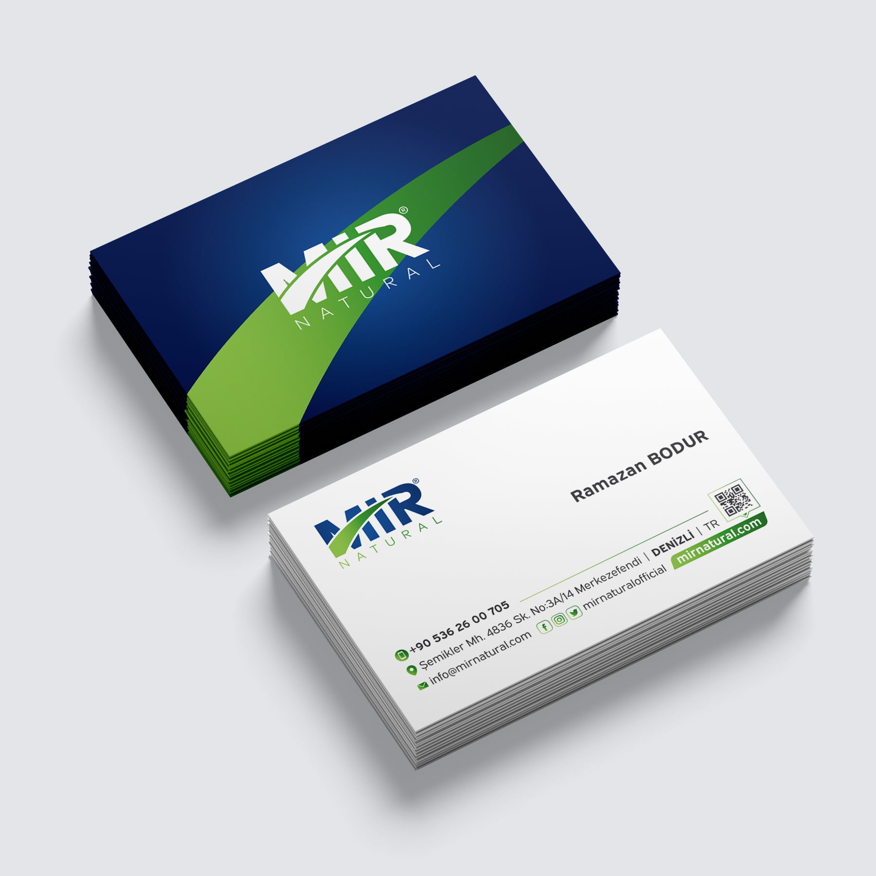
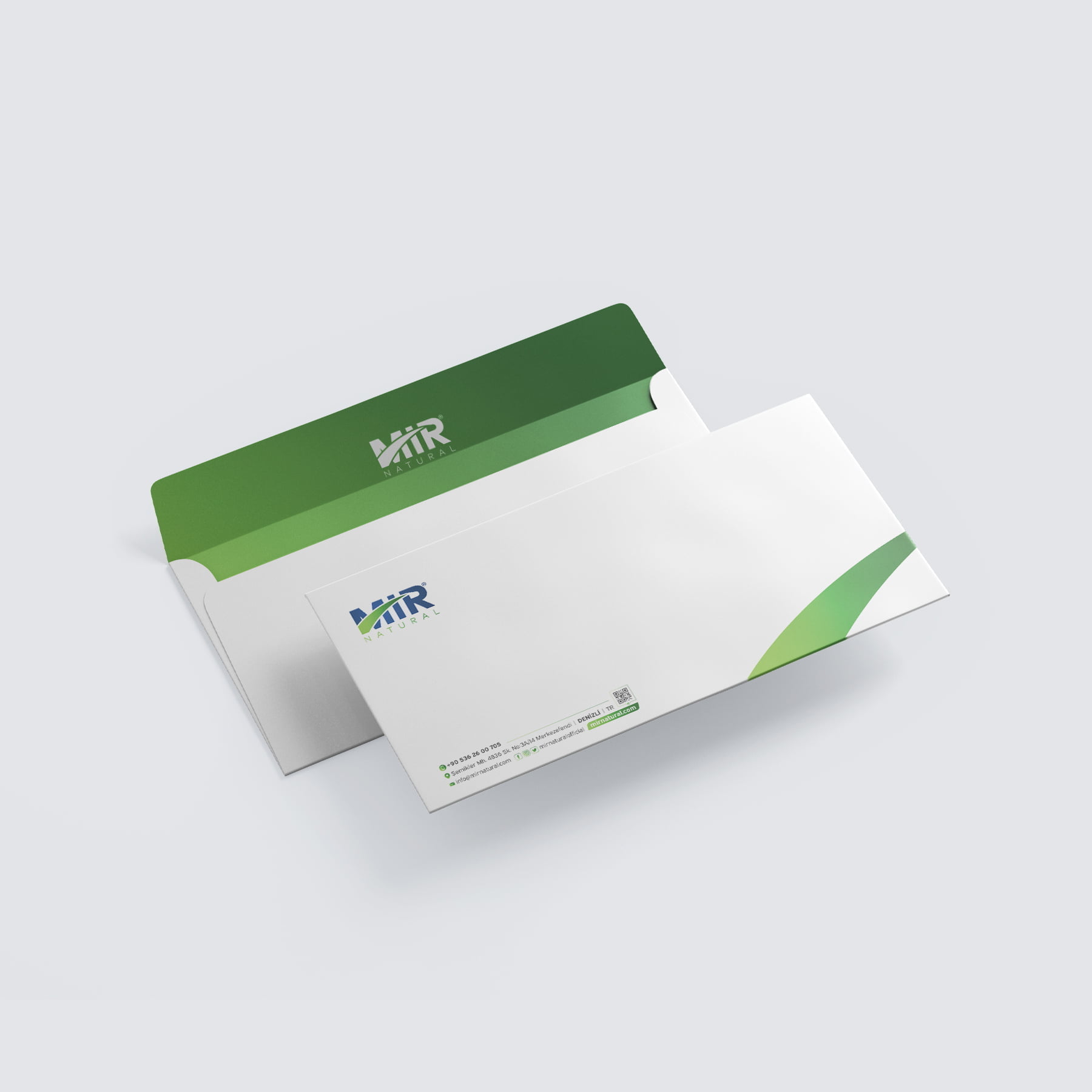
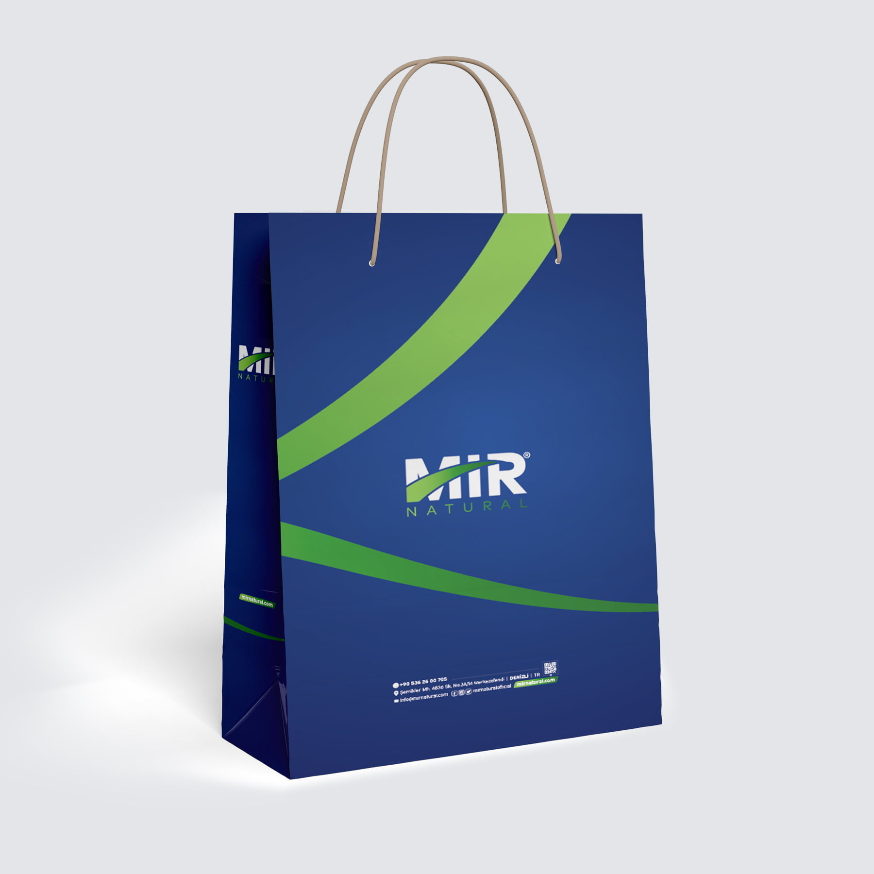
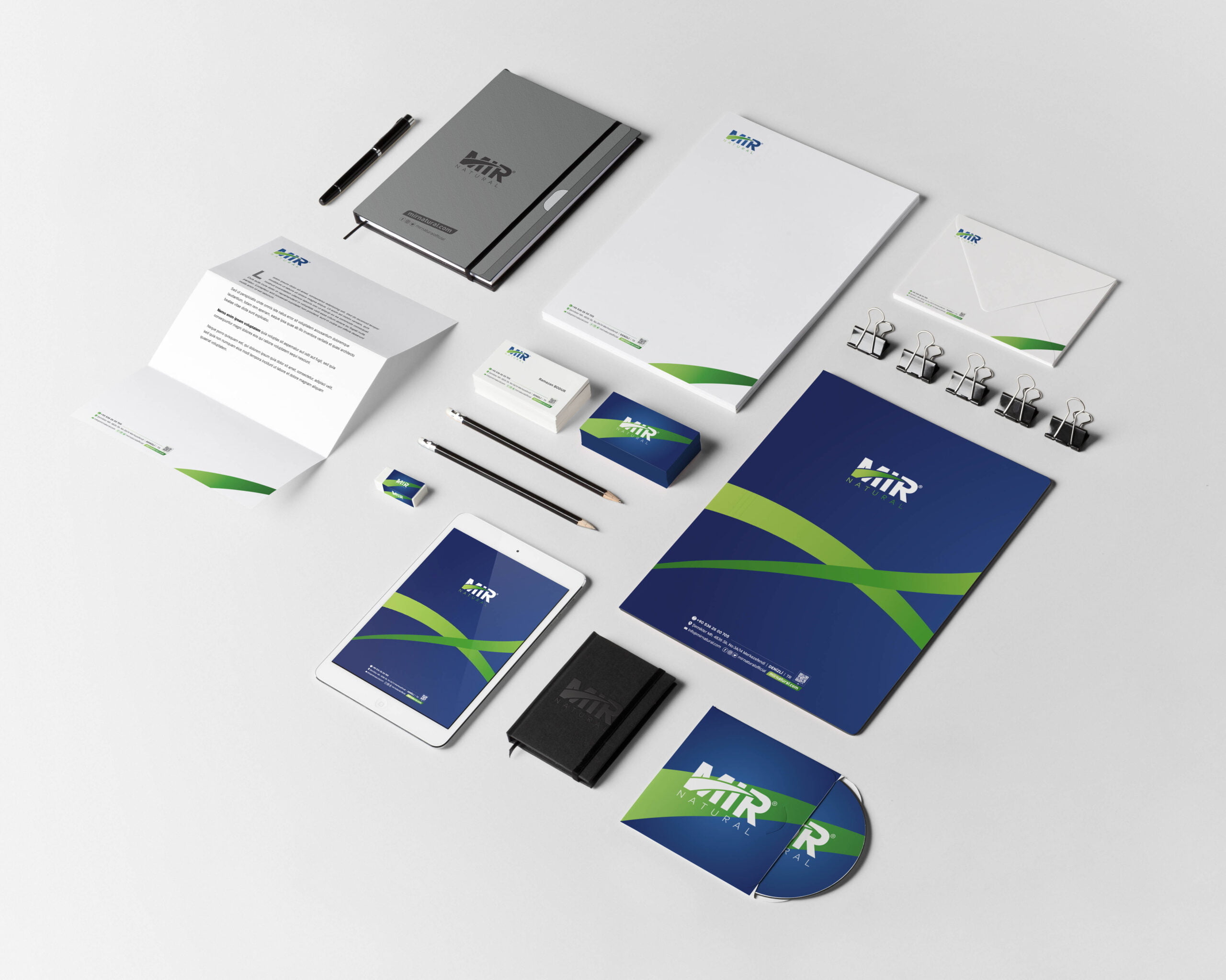
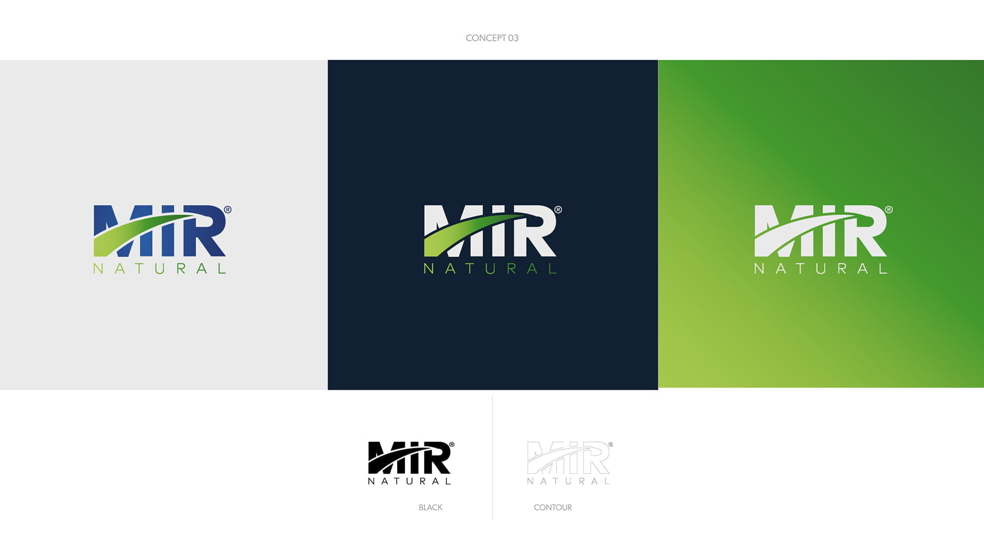
MIR Natural® invites you on a journey to feel good. With its natural cosmetics, it makes its customers feel good and valued. It takes its naturalness from its name and symbolizes a precious journey.

inspired by the line of naturalness
on a worthwhile journey
Corporate Identity Design
Learn the story of mir natural
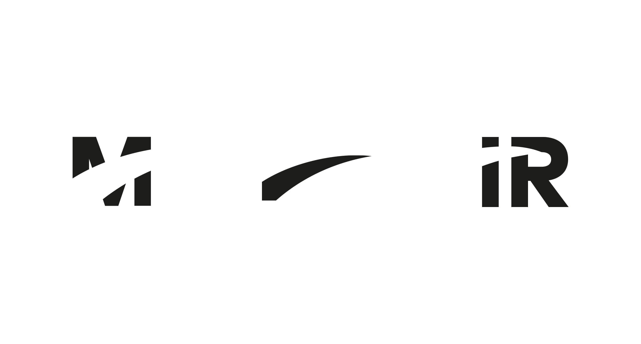
MIR Natural®‘s logo design was inspired by its name to reflect its decisive stance and visionary line. MIR means peace in Russian and as a brand, it appeals mainly to the Russian market. Therefore, concentrating on these two main reasons, we reflected the name MIR in a way that emphasizes naturalness with an aesthetic understanding. To emphasize naturalness in cosmetics, we placed a line from the letter M to the letter R. In this way, we emphasized the beginning of journeys that make themselves valuable with MIR.
Ramazan Bodur's comment.
Watch founder Ramazan Bodur comment on the performance of our work for MIR Natural®.

