

PREMIUM FOOD
Rem Olive
Partner
Industry
Location
Scope
Year
Rem Olive
Premium Food
Bursa, Turkey
Brand Identity Architecture · Digital Asset Design
2018
The story of a land, not merely a product.
Project Information
“Differentiation in the olive category is achieved not by speaking louder, but by speaking clearer.”
Context and Challenge
In food, especially for a product with strong traditions like olives, trust is established before visuals. Consumers look at the packaging and make a decision before tasting the product. In this category, a brand's task is to evoke both appetite and trust simultaneously.
This is where premium food brands differentiate themselves. The value of an olive oil brand comes not from the “extra virgin” label, but from the sense of integrity it conveys. What other products on the shelf loudly proclaim, a strong brand quietly makes you feel. This was Rem's need: to establish naturalness not as a slogan, but as a character ingrained in every detail of the brand.
The answer lay in the brand's essence. Rem was a product of the earth, but its presence on the shelf needed to speak like a craft brand. The balance between these two extremes became the starting point for the entire identity.
Insight and Construction
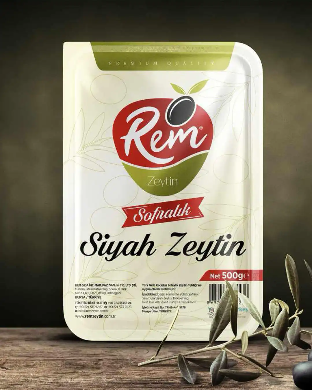
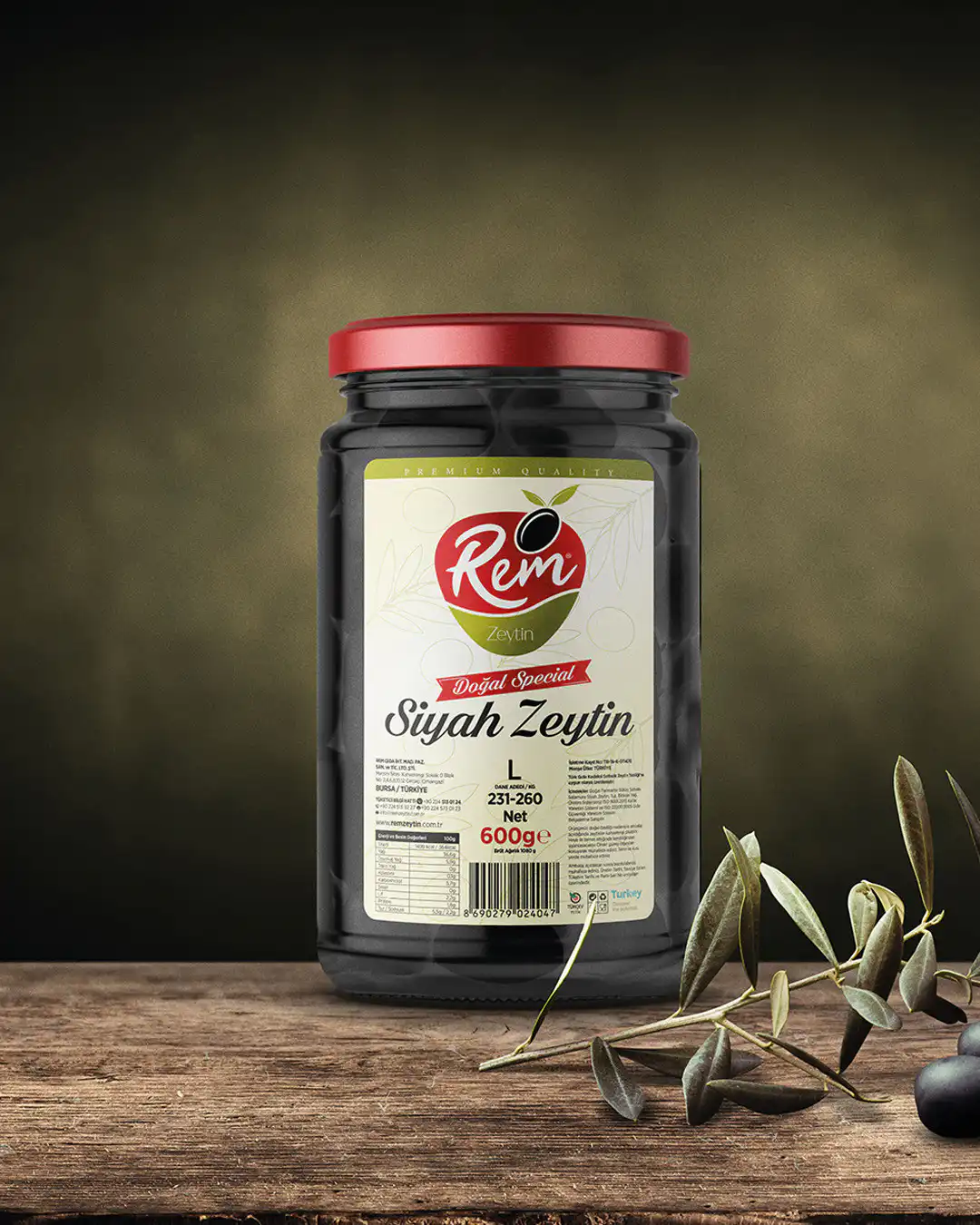
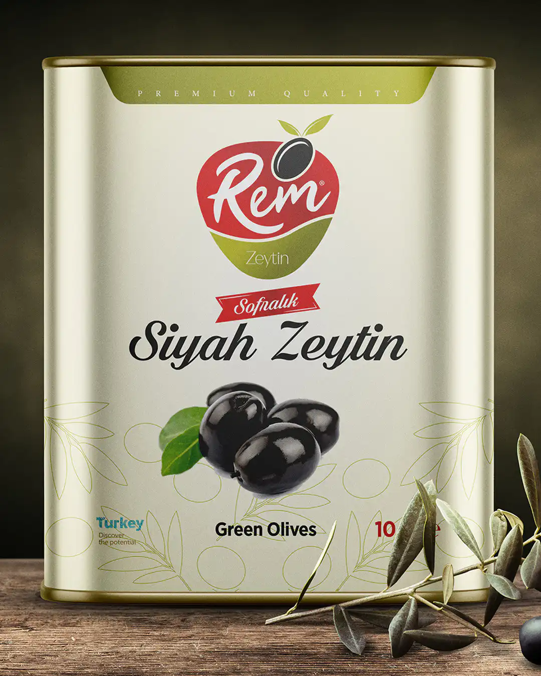
We unified the brand identity around a single principle. Rem had to be natural, but not rustic. Warm, but not messy. Appetizing, but without appearing cheap. These three points of tension were reflected in every detail of the identity.
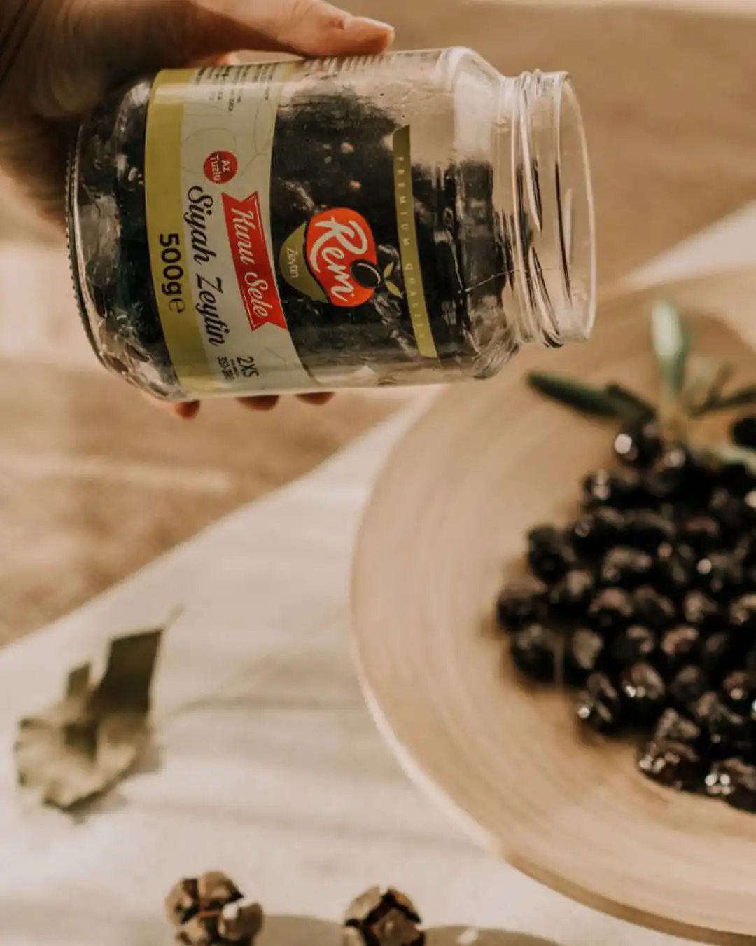
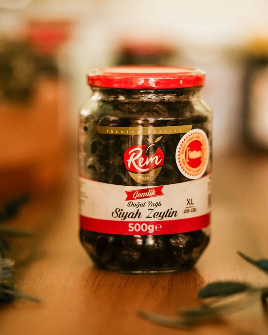
For the logo, we created a line inspired by the form of an olive leaf and the fluidity of olive oil. The leaf conveyed the brand's origin and naturalness, while the fluid line referenced the product itself, the texture of the oil. The entire form was simplified to read more like a signature than a shelf product.
In the color palette, we avoided the category's typical bright green. We used earthy tones, a calm olive green, balanced with a warm accent. This warm accent was positioned as a point of balance that consciously stimulated appetite without cheapening the packaging. Color took on the role of inviting without shouting.
The typography conveyed a simple and trustworthy character. Neither too modern nor too traditional, it stood in the middle ground, much like Rem's positioning—easy to read and clearly visible on the shelf.
We designed the digital presence not as a product catalog, but as a digital extension of the brand's production discipline and its connection to the land. When visitors entered the site, they should feel where the product came from, the care with which it was prepared, and the labor behind it. Transparent production visuals were highlighted. The journey of the olive from field to processing was established as demonstrated trust, not merely claimed. The site spoke by making the process visible, rather than praising the product.
Result
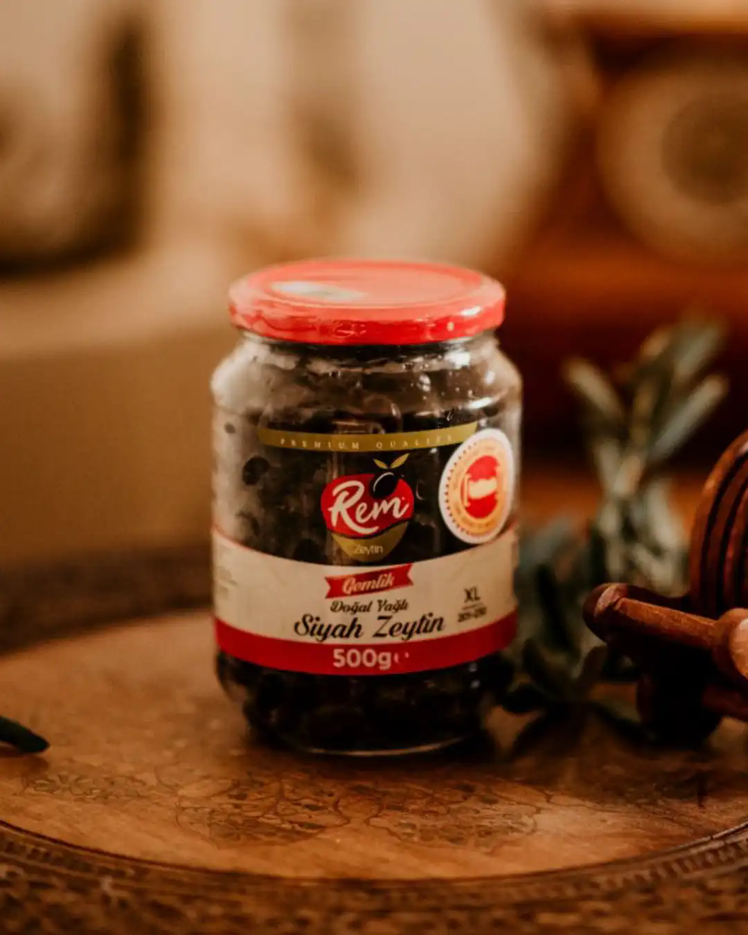
Today, Rem Olive is positioned not as a brand that loudly proclaims “natural” in its category, but one that conveys naturalness through its stance. Among similar products on the shelf, it distinguishes itself with its unique character.
For a food brand to transform from a product into a character is the most challenging leap in an easily imitable category. In a field where everyone claims naturalness, quietly turning that claim into evidence distinguishes the brand not from its competitors, but through its own integrity. Rem has carried this integrity from the very first day of its identity.